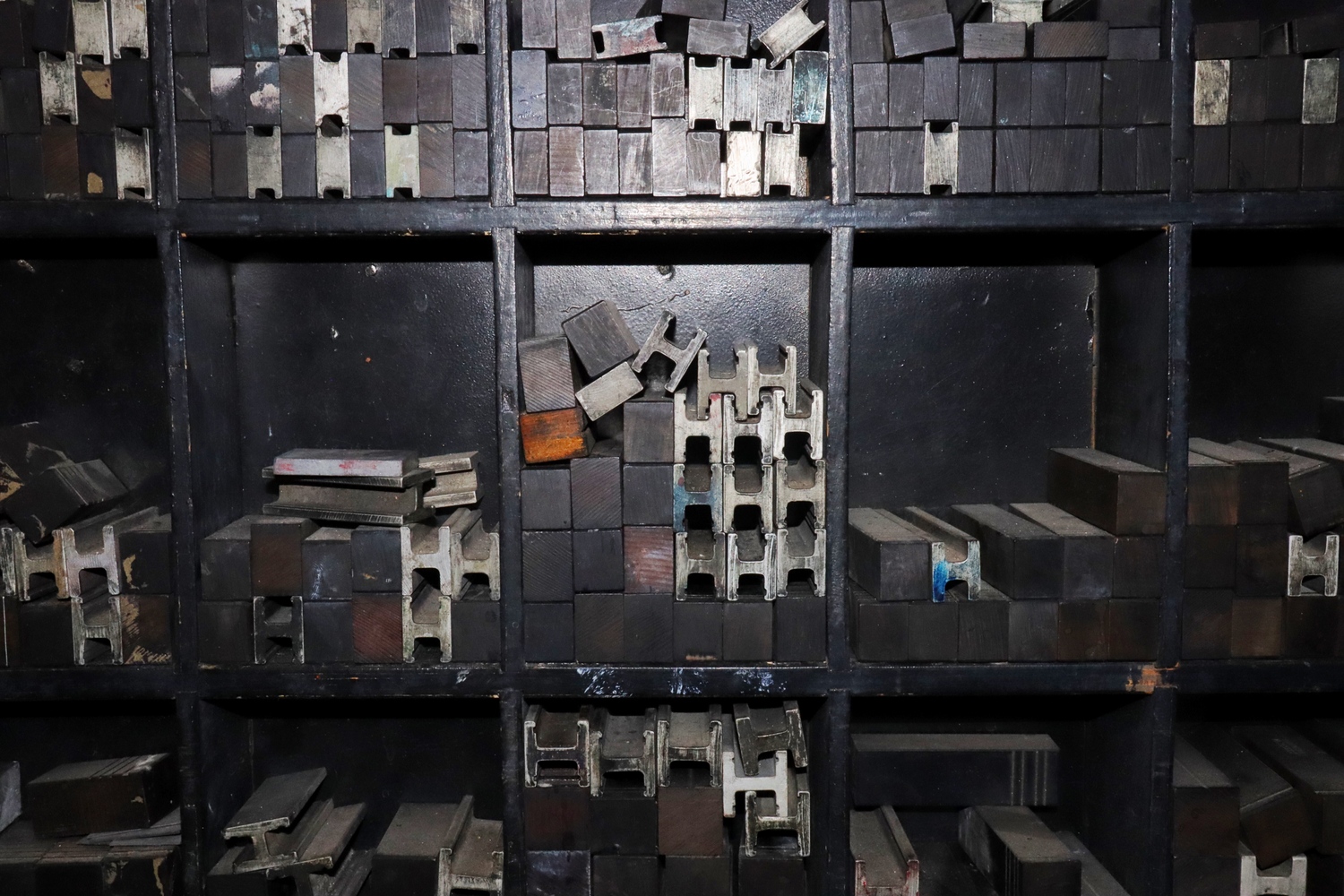
Print Archive, Essex 2020
Natalia, Year 9
I came up with this piece to photograph as the composition of the print spacers caught my eye. The centre of the photo feels really crowded and untidy but as your eye follows the hard steel lines towards the other boxes they seem to be more spacious. This makes the already crowded centre seem even more cramped. The light from the flash hits between the two boxes making your eyes travel upwards, making it seem like the light could be coming from the sun. As your eyes come back down to the centre box the contrast between the hollow spacers and the solid spacers gives a sense of something that is unfinished or unresolved. Maybe the time we're in inspired me to photograph this unresolved and chaotic scene. The small sections of colour also make the grey, white and black areas stand out more. I call this piece Print Archive.
